This week, Harvard University’s Radcliffe Institute for Advanced Study is hosting Vision & Justice, a two-day conference on the role of the arts in relation to citizenship, race and justice. Organized by Sarah Lewis, a Harvard professor, participants include Ava DuVernay, Henry Louis Gates Jr., Wynton Marsalis and Carrie Mae Weems. Aperture Magazine has issued a free publication this year, titled “Vision & Justice: A Civic Curriculum” and edited by Ms. Lewis, from which we republish her essay on photography and racial bias.
— James Estrin
Can a photographic lens condition racial behavior? The rest of this is about the chemistry and physics of a recording and broadcast medium, not the "lens" and not even, until near the end, "the camera" in the sense of the point of view of the photographer in what s/he photographs. Clearly a photographer can take racist pictures and can make someone of a given race look bad, just as one can do of almost anyone. And photographers can ignore the good and poignant photo opportunities black people might present. But except for a few sentences near the end that is not what the author is writing about. She is writing about the quality (or lack of quality) of skin tones in pictures due to the recording or broadcasting equipment and material used. Insofar as the lack of having better equipment and materials or more knowledgeable use of them is wrong and willful, it is a moral wrongdoing, but insofar as the problems are difficult, unsolved ones of physics and chemistry or other forces of nature they are not matters of wrongdoing but just general problems. I wondered about this as I was preparing to speak about images and justice on a university campus.
“We have a problem. Your jacket is lighter than your face,” the technician said from the back of the one-thousand-person amphitheater-style auditorium. “That’s going to be a problem for lighting.” She was handling the video recording and lighting for the event.
It
was an odd comment that reverberated through the auditorium, a
statement of the obvious that sounded like an accusation of wrongdoing. But
it was only an odd or accusatory-sounding comment in the context of
perceived racial prejudice or race
being the issue that prompted it. I am presuming that the
technician was white. I, a white male, have said something like
that to a white woman when it was a similar problem which I will explain
below, saying a different blouse, dress, or jacket she brought for a
photo session would solve the problem. And if the technician had
been black, it would not have sounded racist or potentially racist but
would have just been an explanation of a technical or aesthetic
problem.
Moreover, I am guessing that the technician didn't even think about it
in any kind of racial terms and that is why she said it that way, not
realizing it would sound racial or even racist, until after everyone
reacted.
Another technician standing next to me stopped adjusting my microphone and jolted in place. The phrase hung in the air, and I laughed to resolve the tension in the room then offered back just the facts:
“Well, everything is lighter than my face. I’m black.”
“Touché,”
said the technician organizing the event. She walked toward the
lighting booth. My smile dropped upon realizing that perhaps the
technician was actually serious. She
probably was serious, but about a technical or aesthetic problem given
the recording or communication medium, not about your being black.
I assessed my clothes — a light beige
jacket and black pants worn many times before in similar settings. --
settings which probably had the same problem but one either not noticed
or not cared about by a technician less conscientious or less
perceptive. Lots of people wear colors and shades that don't suit
them as well as another color or shade would, and very few people are
going to bring that to their attention or 'call them out' on it, because
that is generally taken to be rude. As a photographer I try not
to take pictures I think make people not look their best, and I explain
to my clients generally why something is not quite right and not going
to look good in the picture. Most people really appreciate that,
but a few get offended and take it as an insult. The people who
are not offended will then gain great confidence that makes their photos
even better when I say something looks great while I am shooting,
because they know that I would not have said that, or even taken the
picture, if it didn't. Given the technician's obvious regret later
at having caused an embarrassment for everyone, I think it pretty safe
to say she was likely not racist (at least about this) and had never
considered that the point she was making would be racist. Once the
room reacted the way it did, and Dr. Lewis made the comment she did,
the technician probably was embarrassed and thought she had made a
socially and racially bad faux pas, when didn't mean it in that way at
all, even subconsciously.
As
I walked to the greenroom, the executive running the event came over
and apologized for what had just occurred, but to me, the exchange was a
gift. But
the apology was for causing the embarrassment, particularly if it was
unintentional and made her feel that she must have been
insensitive.
Had the comment been taken what I believe is the right way and the way
it was meant, there would have been no need for embarrassment or an
apology. No one, including Dr. Lewis, would have even considered
it to be wrong.
If, for example, she had been a white person with a summer tan, the
problem would have been the same, but the comment would have evoked more
of a question such as "What is wrong with that?" or "How is that a
problem?" than a gasp of perceived recognition of a moral failure and
surprise, stunning breach of social propriety.
My work looks at how the right to be recognized justly in a democracy has been tied to the impact of images and representation in the public realm. It examines how the construction of public pictures limits and enlarges our notion of who counts in American society. It is the subject of my core curriculum class at Harvard University. It also happened to be the subject of my presentation that day.
It is what my grandfather knew when he was expelled from a New York City public high school in 1926 for asking why their history textbooks did not reflect the multiracial world around him. The teacher had told him that African-Americans in particular had done nothing to merit inclusion. He didn’t accept that answer. His pride was so wounded after being expelled that he never went back to high school. Instead, he went on to become an artist, inserting images of African-Americans where he thought they should — and knew they did — exist. Two generations later, my courses focus on the very material he was expelled for asking about in class.
After the presentation was over, the technician walked toward me as I was leaving the auditorium. I had nearly forgotten that she was there. She apologized for what had transpired earlier and asked if one day she might sit in on my class.
What
had happened in this exchange? It can be hard to technically light
brown skin against light colors. This
is misleading and makes it sound like a problem of correct
exposure. The problem the technician likely had in mind was not
about degree of exposure, but about the perception of light and contrast
in ways I will discuss as we go. Yet, instead of seeking a solution, the
technician had decided that my body was somehow unsuitable for the
stage. This
is jumping to a conclusion
logically unwarranted by the assertion that was made. When the
problem is between skin tones and clothing, or between skin tones and
background, or skin tones and foreground, that just means there is a
conflict, and since skin tones are not what is going to change, then it
means either clothing needs to be changed or the
person needs to be in a different foreground or background, or
possibly, but less likely helpful, the lighting needs to be
changed. If you try on something in a clothing store and people
say the color of it doesn't suit you, that is not a criticism of your
coloring, but of the fabric's being compatible with it. Normally a
comment like "that color doesn't suit you" would be followed by
something like "try the green one" or one of the other colors.
In
doing portrait photography, I tend to generally prefer a darker
background and foreground to let the main subject stand out from
it. I think that normally helps the person (even one with dark skin) look warmer, more
personal, more intimate, and more
vibrant. There are exceptions, and there are some really great
portraits even with stark white backgrounds. But generally when
people, particularly women (who generally had more options for what to
wear than men) I have never met phone me to make a photo appointment, I
recommend they bring some different clothes, but particularly a couple
of things with as dark and rich a shade of whatever color suits them
that they like, and explain that deeper richer colors tended to look
better than pastels or white, unless they felt they really looked good
in white or unless the white clothing was lace or possibly a shiny
satiny type of material. Lace tended to soften the white and give
interest with texture, and satiny material tended to make much more
vibrant and interesting light patterns, with shinier and darker places
that gave a nice flow. Exceptions would be if the clothes and hair
were too close in color and tone so that the hair got lost in the
clothes or if a woman was wanting to show off her figure, then solid,
non-reflective black would normally not be as good because you couldn't
get shadows to show and distinguish the contours. Shiny black can
be okay for that though. But for a close-up portrait, black was
normally really good for almost every color skin, apart from the
blending hair issue. This also allows you to have shadows under
the chin or on the side of the cheek to contour features and hide chin
and neck or fat issues, which you cannot do very readily, if at all,
with someone wearing white or pastels.
There
are some other possible problems with clothes too, and some of this and
the above is a matter of personal taste or individual psychological
response, and it is difficult to tell how many others might share the
feeling. But for a portrait, some shades or colors or patterns or
textures may be too distracting
or overpowering even if they suit the person aesthetically. They
might simply detract from looking at or appreciating their face and
features. I noticed,
for example, that black women quite often, and sometimes blonde white
women, wore bright, rich red dresses for a portrait, and I finally asked
why that was, because it didn't seem a good color for them for a
portrait. The answer was that because this picture was going to be
in color they thought they needed to add some color to themselves,
because they felt they didn't have any or enough color. I
explained that the color for a portrait was too distracting from their
face and their beautiful skin tones and features, and that for the black
women, their skin color would show up beautifully in digital
photography and that was the only or main color they needed -- that
their clothing should just frame their face, not
compete or distract from it. And this is not just about color, but
sometimes a pattern can be too busy or problematic in some other
way. Stripes can look okay or not, depending on their direction,
width, number, etc. Polka dots normally would be too
busy. I ask people to bring a couple of different shirts,
blouses, sweaters, jackets, or dresses for a portrait because there may
always be some photography issue with one they wouldn't have known
about. One, for example, with men is one of those dress shirt
collars that doesn't allow a
tie to cover up the top button, and leaves a gap that makes it look
like the tie knot has not been pushed up into place enough. It may
be an intentional fashion design, but it tends to just look sloppy to
me and many others.
If the client prefers, I can usually retouch the picture to make the tie
appear to be all the way up, but it would be better not to have the
problem to begin with. There are all kinds of potential problems,
some of which are common and others rare. I have had a couple of
men whose suit jackets had a pattern of threads that showed up
iridescently with the flash. Women's sparkly makeup can look like
multiple flakes of dandruff. One woman's bra and panties showed up
one time under her black dress because the material allowed the light
from flash to go through it in a way that didn't occur with ambient
light. That was an embarrassing, bizarre surprise to both of us.
It made her feel improperly dressed and made me feel like I appeared to
be a pervert using some sort of secret clothing X-ray camera.
Now normally
if you are using a predominantly dark background, then the lighter part
of the picture will tend to dominate the eye, which is good about
making the face and eyes show up, but is bad if the clothing is light
and you are trying to make the face and eyes dominate the photo.
And it also means that bare shoulders on a white woman will tend to
dominate the picture, which is not good if you don't want them to be
that noticeable or take away drastically from the face. Bare
shoulders look much better in a photo for black women generally than for
white women because of that. But if one's shoulders would be not
particularly attractive, or would distract from the face, then no matter
what color one's skin it is better to wear a darker top.
There is a lot more to the aesthetics of all this, but one easy example
is if you are doing a group picture, you normally don't want a person
with black hair seated in front of someone standing who is wearing a
dark suit or blouse, and you don't want someone with white hair seated
in front of someone wearing a white dress. Similarly, dark hair
will get lost if the person with it is standing in front of a dark leaf
tree, like a magnolia, and real light color hair will get lost against a
light sky or snow or white sand beach.
There
are also exposure issues that need to be taken into account,
particularly if one doesn't have an unlimited lighting budget or the
kind of lightening available that might be necessary to compensate for
problems of exposure and definition. Depending on the
recording medium you are using, contrast and saturation can be
problems either aesthetically or in terms of definition that distinguish
one portion of the picture from something nearby. Moreover, light
on a subject diminishes quite rapidly with the square of the distance
the light is
from it. If you shine a light on two things at the same time where
the first is 2 feet from you and the second is 8 feet from you, the
light on the closer subject will be 16 times brighter than the light one
the further subject because it is 4 times closer. That means if,
for example, you are shooting with a single flash mounted on your camera
or filming with a single light source, and you are doing something like
a group photograph, you shouldn't put pale blondes wearing white in the
front row with black people wearing dark clothes in a back row, because
exposing for the back row will wash out the blondes and exposing for
the front row will disappear the black people into darkness. And
the less sensitive your recording medium is, whether electronic or film,
the more problems you have distinguishing or emphasizing colors,
shades, and lines too close in appearance, though that can be a boon for
disguising things you do not want to show too clearly. But a
typical problem photographing weddings with on camera flash is getting
the detail in the dress, often in the foreground
of a picture, with details in the then darker background. Or a
particular problem facing people who shoot weddings of black couples is
the bride wearing bright white with the groom wearing a deep black tux,
particularly if the bride is much lighter skin than the groom. I
typically recommended that black grooms think about wearing a charcoal
grey tux rather than black if they feel it looked just as good on
them. It will show up better in the pictures and help them look
better in the pictures shot with flash, which will be most of the indoor
pictures.
But
I had a similar problem in the studio one time with a
white couple who were in for an engagement picture of themselves
together. She had a
really white, creamy complexion that was a maybe a slight shade darker
than
Casper the ghost. She was very pretty, but her skin was simply
milky white. He had a pretty deep tan. When I first
began to pose them, I put her to my left in the picture and him to my
right for psychological/aesthetic reasons and I had the studio light on
her side, for similar reasons. That is the way I tend to
photograph couples, though there can be exceptions. But because
that put the light closer to her, it exaggerated the difference in their
skin tones and made the photo untenable to be shot that way. I
had to decide whether to move the light, putting shadows on the side
opposite of where I prefer them, or whether to swap which side they were
on relative to each other, and I couldn't tell just by thinking about
it. I apologized for having to experiment with the set up and how
they were arranged, but said I was having trouble getting the lighting
figured out right because he was so much darker than she was and I
wanted to balance them better, not make it even worse. They both
laughed and he said "Everybody is darker than her." She was used
to the problem in pictures and always came out just way lighter than
everyone else, sometimes just looking totally washed out if the overall
picture was even slightly overexposed, and particularly if she were in
front and the photo was taken with an on-camera flash.
More
about this later, but, for now, you should get the picture (pun
intended) that the problems of the physics, chemistry, and aesthetics
are not necessarily at this point simply racial discrimination in doing
photography well.
Her comment reminded me of the
unconscious bias that was built into photography. By categorizing light
skin as the norm and other skin tones as needing special corrective
care, photography has altered how we interact with each other without us
realizing it. My
own experience with photography for more than 50 years now is that
white skin is not "the norm" and that it was just as problematic for
photography (particularly color photography) as was black skin, and that
digital photography has corrected the problems for both, and, if
anything, even favors black skin, making it look truly spectacular and
desirable to have, to look at, and to touch. White skin
photographs far better digitally than it did on film, but black skin
surpasses it digitally, though it usually was worse on film.
Photography is not just a system of calibrating light, but a technology of subjective decisions. Light skin became the chemical baseline for film technology, fulfilling the needs of its target dominant market. This is only true in a seriously narrow way. Color film and prints did "sell" well, but it was a neat novelty for people and they had little to compare its quality to. And yes, color film, and color film processing labs tended to do worse color tones with black people than with white, and I don't doubt that with regard to color film prints, that may have sometimes been due to either racial ignorance, prejudice, or disrespect. But it may also have been due more to film chemistry that film manufacturers had not been able to overcome at the time. The problem may not have been a moral one at all. But the fact is that color film and prints were terrible for white people and white skin too. And photographers who were conscientious had to work with the employees in color film labs to teach them what skin tones they wanted in their pictures. After taking in sample prints of what I wanted and what I didn't want to people in any new lab I used, my standard reminder "Special Instructions" on every order I turned in was "Rich, vivid, non-yellow colors please."
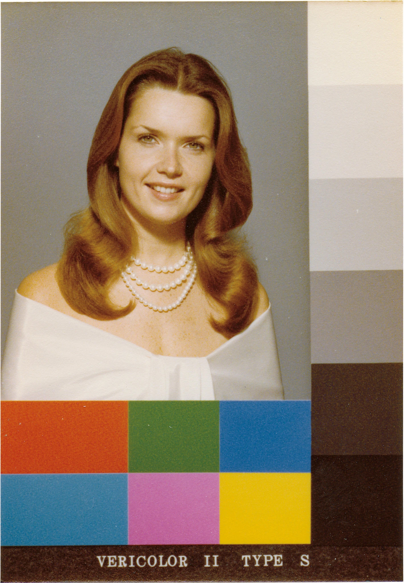
For
example, developing color-film technology initially required what was
called a Shirley card. When you sent off your film to get developed, lab
technicians would use the image of a white woman with brown hair named
Shirley as the measuring stick against which they calibrated the colors.
Quality control meant ensuring that Shirley’s face looked good.
But look at the Shirley card at the beginning of this essay!! She looks like she needs a liver transplant. She is jaundiced and the colors are just weak and washed out or faded looking. And that is the standard way pictures of people came out of color film processing labs. It was ridiculous. But yes, it was color, and color was considered to be a good thing, so the pictures were liked. But that is only because people didn't know better. They might see better color in high quality magazines, but that was a whole other world. Professional photographers in Hollywood and on Madison Avenue had access to equipment and techniques most people did not, and they worked with lab specialists who were particularly talented and who also had excellent equipment not likely available at your drugstores lab or in the one-hour photo stores that later opened up. Color processing was improving throughout the 1970's, '80's, and '90's, but it was still a gamble what you would get back as a print if you turned in the same negative to the same lab two different days, even two days in a row. It was such a hassle, and so inferior to good black and white that I preferred shooting black and white portraits and convinced most of my clients, when they saw my work, that black and white would be better for them. Most of them chose that then and were happy. I did my own processing and printing of black and white, so I had more control of the final product, which helped. But the end result was just better than color prints. Digital has reversed the quality, to the best I can tell. Digital pictures, done decently, are far more vibrant than all but the best color prints. Compare the Shirley Card colors and tones with:


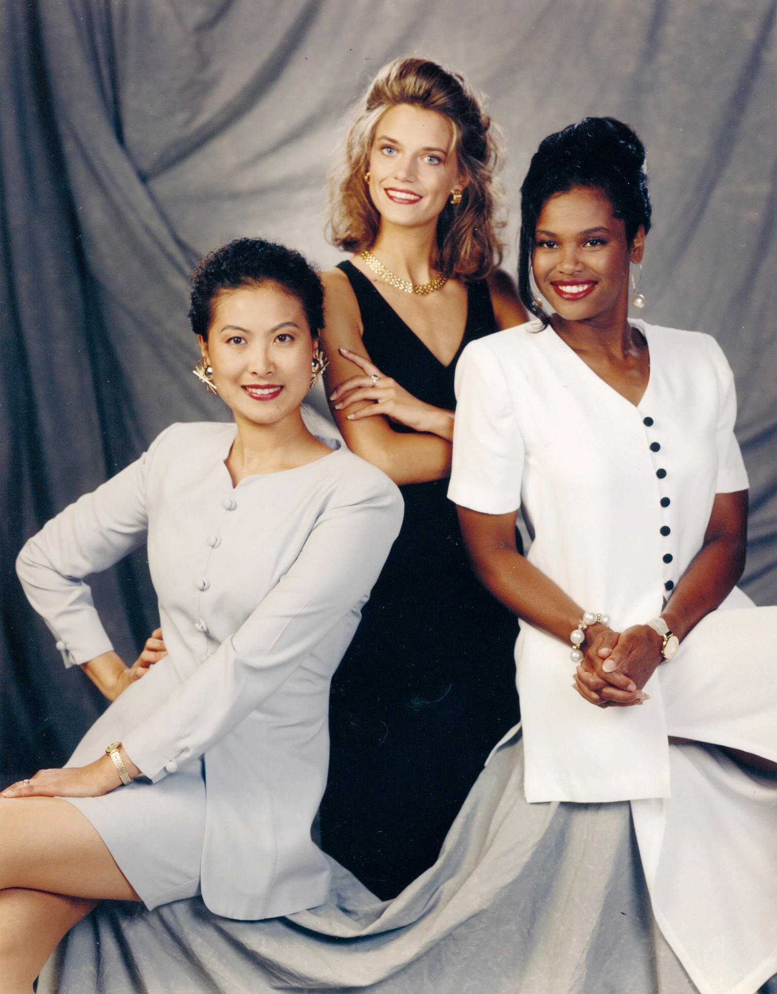
It has
translated into the color-balancing of digital technology. In the
mid-1990s, Kodak created a multiracial Shirley Card with three women,
one black, one white, and one Asian, and later included a Latina model,
in an attempt intended to help camera operators calibrate skin tones.
These were not adopted by everyone since they coincided with the rise of
digital photography. The result was film emulsion technology that still
carried over the social bias of earlier photographic conventions. But
this picture looks terrible too, and the clothes worn by the black
woman and the Asian woman look as bad on them as the white or cream
color drape on the Beverly card woman. The white woman in the
multicultural card is washed out; the black woman is partly washed out
on her forehead and cheeks and her suit is harshly white and dominates
her part of the picture
and maybe the entire picture, though the black dress stands out nicely
against the grey background and the two suits in front of it. The
Asian woman's skin tones are very unnatural, and the color of her outfit
does not suit her very well and is a very blah or boring faded shade of
gray it appears. Apparently the clothes are meant to show the
blackest black, whitest white, and some gray tone, though it appears
to me closer to white than to a mid gray.
It
took complaints from corporate furniture and chocolate manufacturers in
the 1960s and 1970s for Kodak to start to fix color photography’s bias. Or to fix Kodak's lack of concern for improvement of its color film in general,
other than to make more light sensitive film that could take pictures
in lower light or in good light at faster shutter speeds. Or it
just gave them a known monetary incentive for changing film.
Earl Kage, Kodak’s former manager of research and the head of Color
Photo Studios, received complaints during this time from chocolate
companies saying that they “weren’t getting the right brown tones on the
chocolates” in the photographs. Furniture companies also were not
getting enough variation between the different color woods in their
advertisements. Concordia University professor Lorna Roth’s research
shows that Kage had also received complaints before from parents about
the quality of graduation photographs — the color contrast made it
nearly impossible to capture a diverse group — but it was the chocolate
and furniture companies that forced Kodak’s hand. Kage admitted, “It was
never black flesh that was addressed as a serious problem at the time.” But
the atrocious color of 'white flesh' was never addressed as a serious
problem at the time either. And it was about color in general,
even of landscapes, not just skin tones of people. The preferred
medium of photographers who shot advertising was color transparency
(i.e., 'positive' or slide rather than negative) film. It was more
vibrant, for whatever reason.
Fuji became the film of choice for professional photographers shooting subjects with darker tones. Also for other photographers as well. The company developed color transparency film that was superior to Kodak for handling brown skin and color in general. Yet, for the average consumer, Kodak Gold Max became appealing. This new film was billed as being “able to photograph the details of a dark horse in lowlight,” a coded message for being able to photograph people of color. I can't speak to that in terms of its being a coded message, and I don't recall seeing that even advertised. What I recall was there was an emphasis on more light sensitive film, even up to 1000 ASA, which was remarkable at the time, though it was grainy (more sensitive film was generally grainier film, but I once shot some 25 ASA film and felt that you could only use it outdoors between 11am and 1pm in July on a sunny day to get decent images. That was something of an exaggeration on my part but not that much. The photo I remember being advertised for the higher speed, more sensitive film was a photo of someone in profile blowing out a single birthday cake (or cupcake) candle with the light on his face supposedly coming from the candle, though I seriously doubt that is how it was shot. More than likely it seems to me that instead of being code for being good film for black people to use was that this was just one other example of how sensitive the film was. Plus, shade or low light is best for shooting dark animal skin and fur. Most amateurs tried to photograph their dogs (and their families) in bright sunlight, which is harsh light even for people, gives bad shadows and sun squints, and makes dark animal fur look almost solid. If you shot it in the shade or on an overcast day, you got much better tones. But that required more sensitive, 'faster' film. When I first learned about this history, I finally understood why my father went, almost obsessively, to the camera store down the street from our apartment in Manhattan in the 1980s to buy Kodak Gold Max film.
Digital
photography has led to some advancements. There are now dual skin-tone
color-balancing capabilities and also an image-stabilization feature —
eliminating the natural shaking that occurs when we hold the camera by
hand and reducing the need for a flash. Yes,
natural light is often better than flash, especially on camera
flash. Studio flash or fill flash for outdoors to enhance natural
light requires skill and a bit of a
learning curve. Modern digital cameras make supplemental fill
flash outdoors easier, but that only helps for when you want the flash
to be straight on from the direction of the camera, which is not the
most artistic lighting. Yet, this solution creates other
problems. If the light source is artificial, digital technology will
still struggle with darker skin. Maybe
with on-camera flash, but not with studio flash. Ever since going
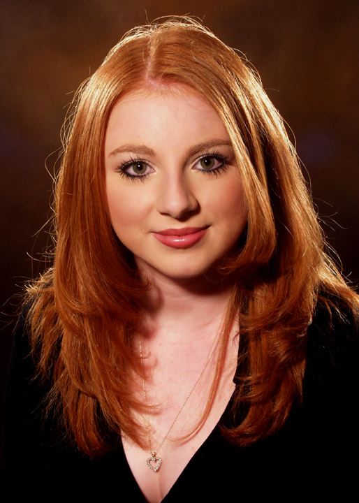
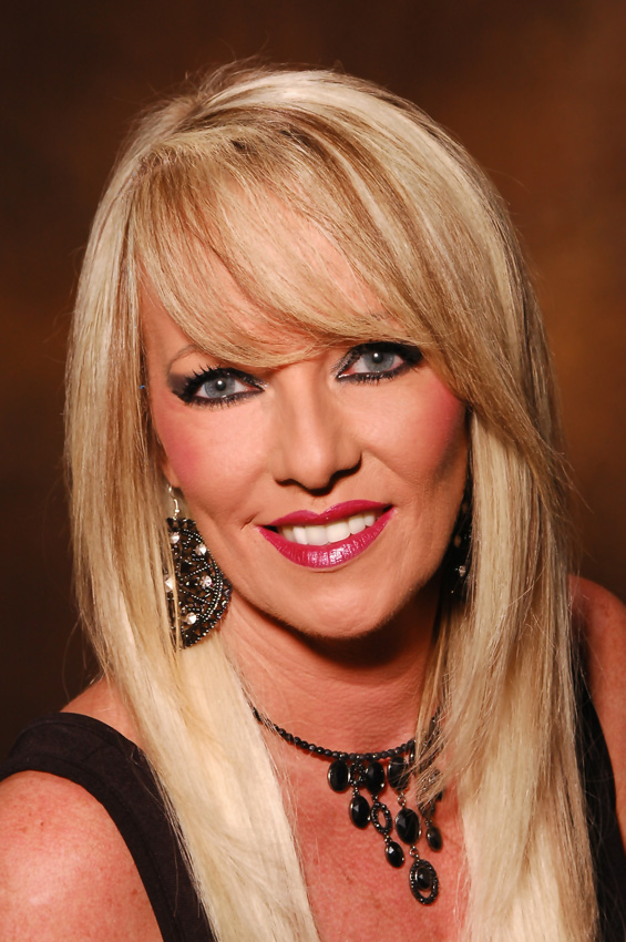
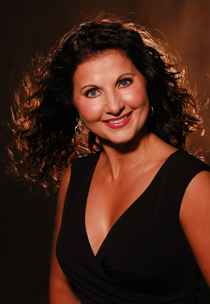
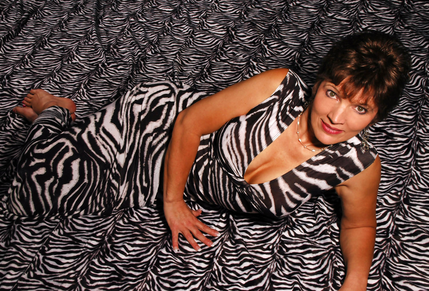
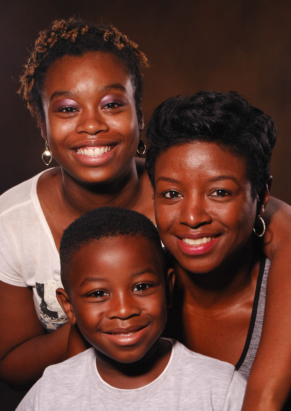
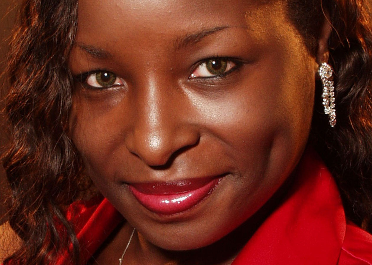
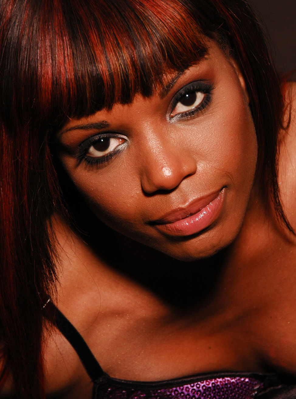
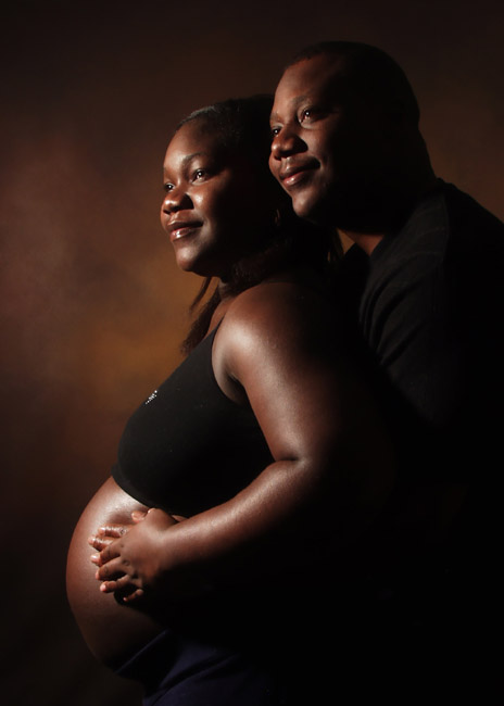
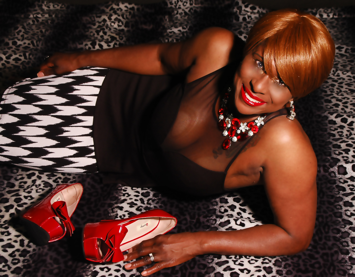
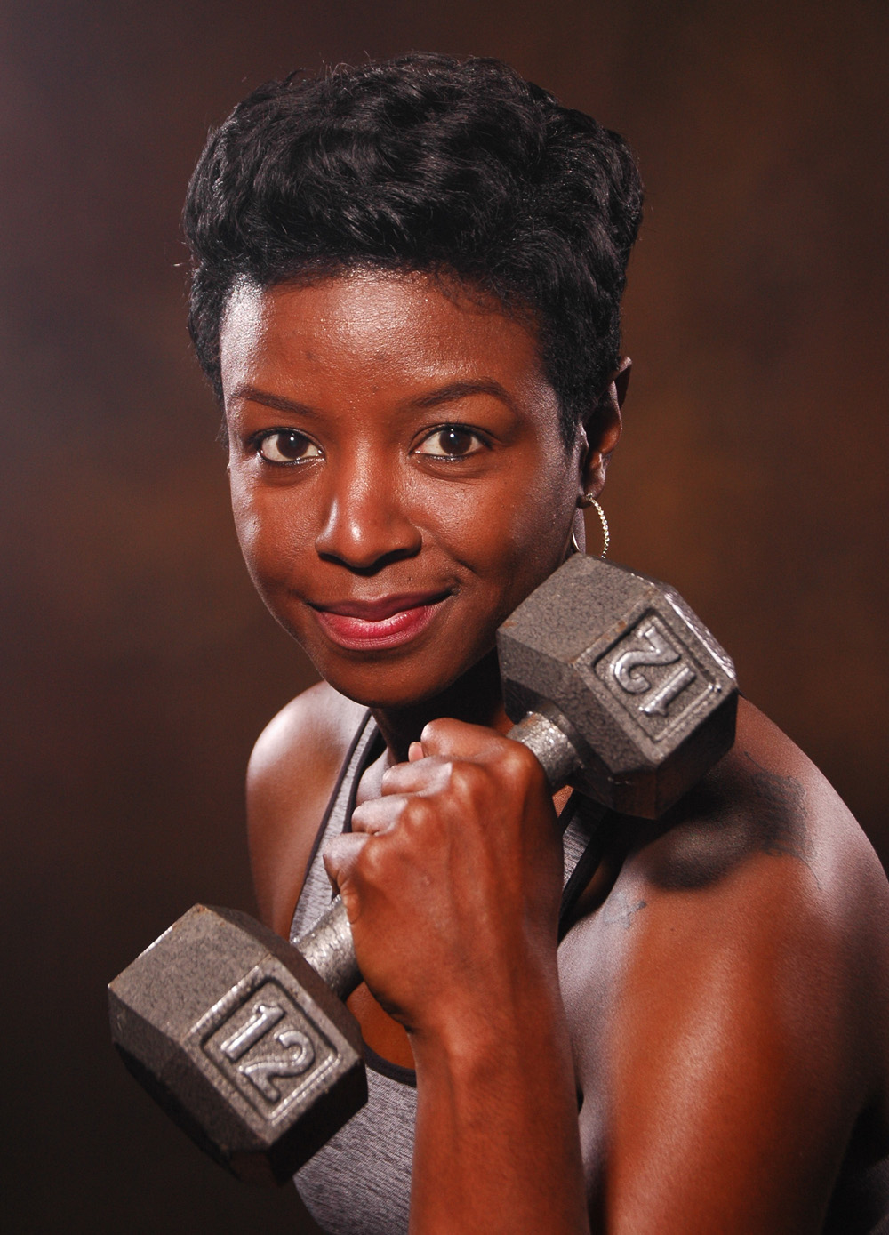
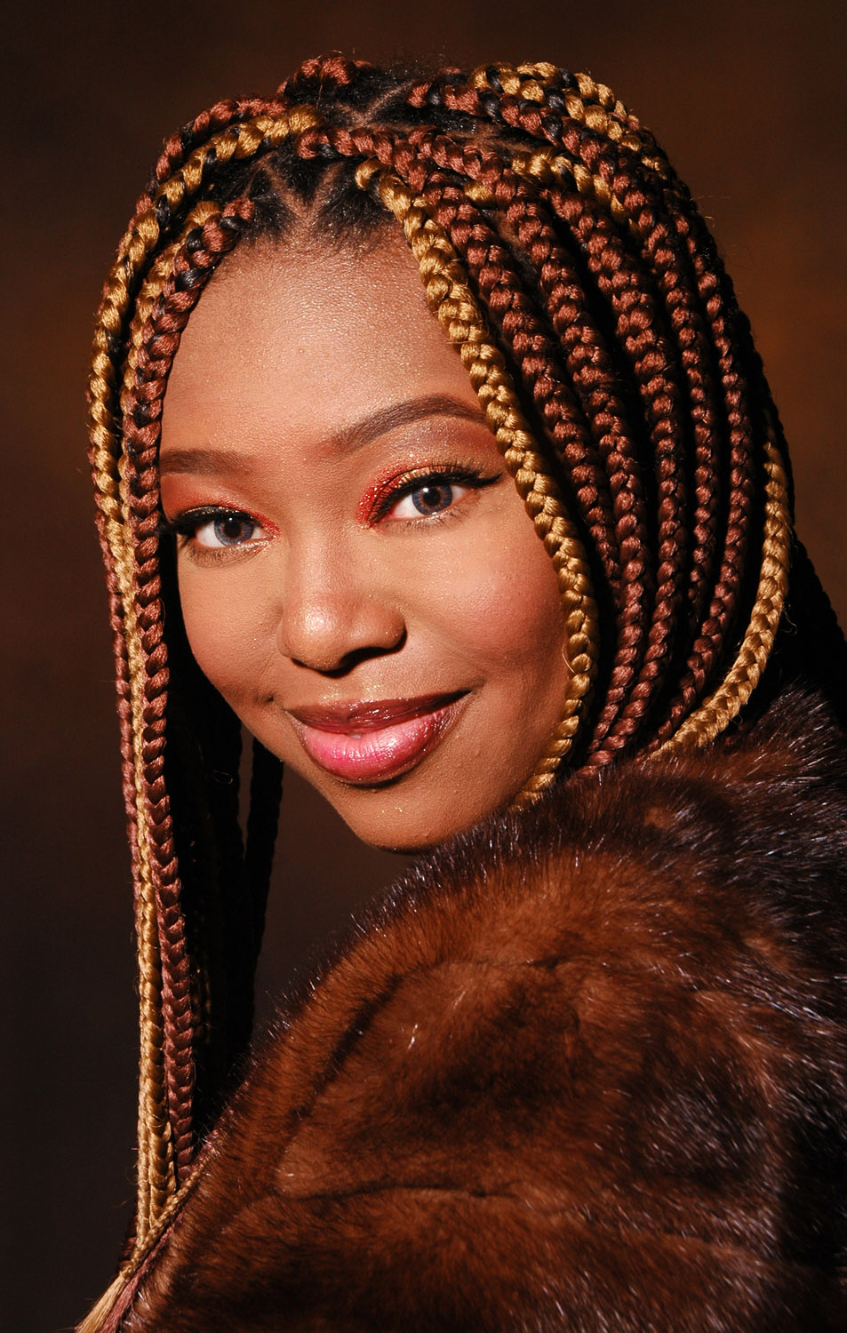
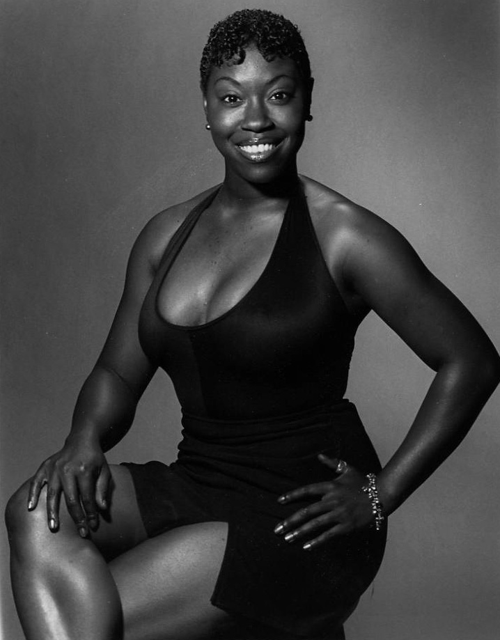
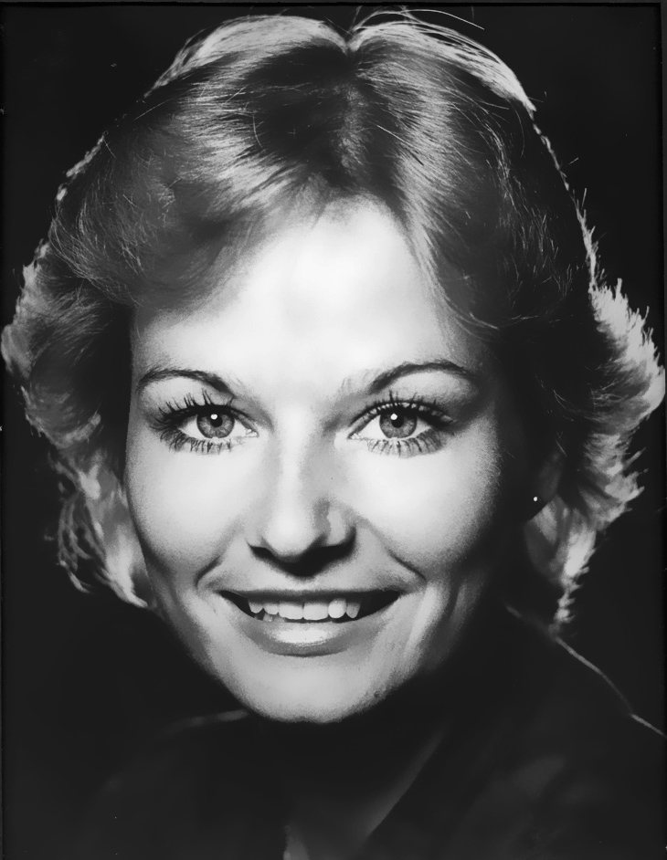
digital, I love shooting black skin in the studio, as in these photos:
Prior
to digital, I photographed black people mostly in black and white to
get vibrant skin tones; color film and processing didn't cut it.
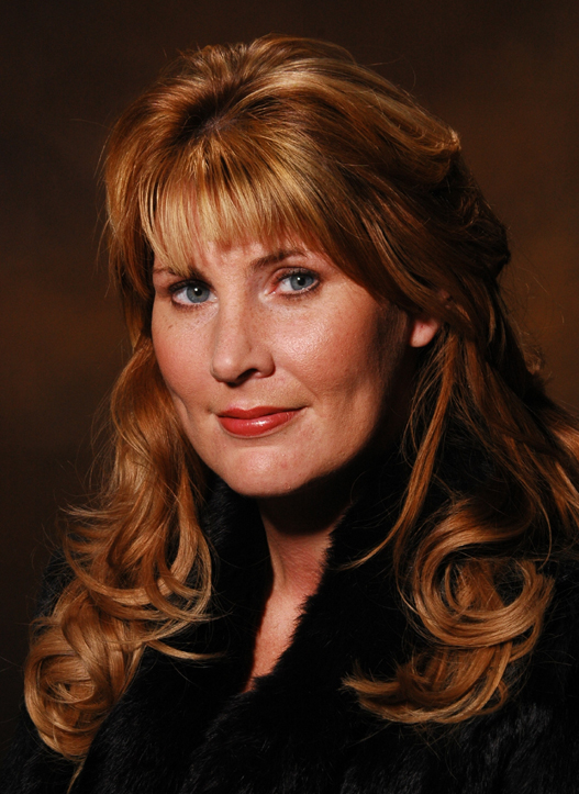
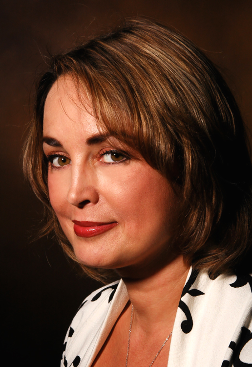
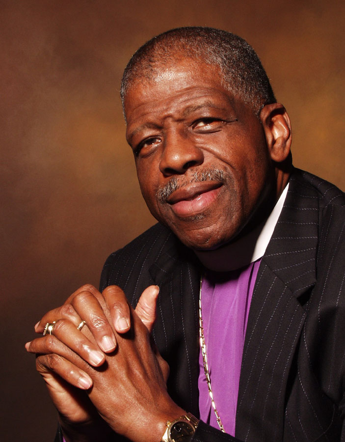
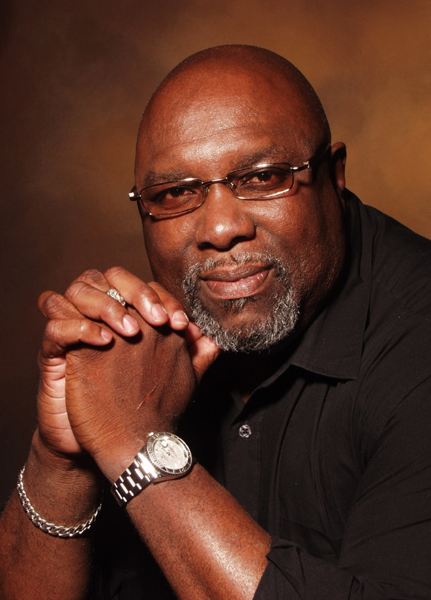
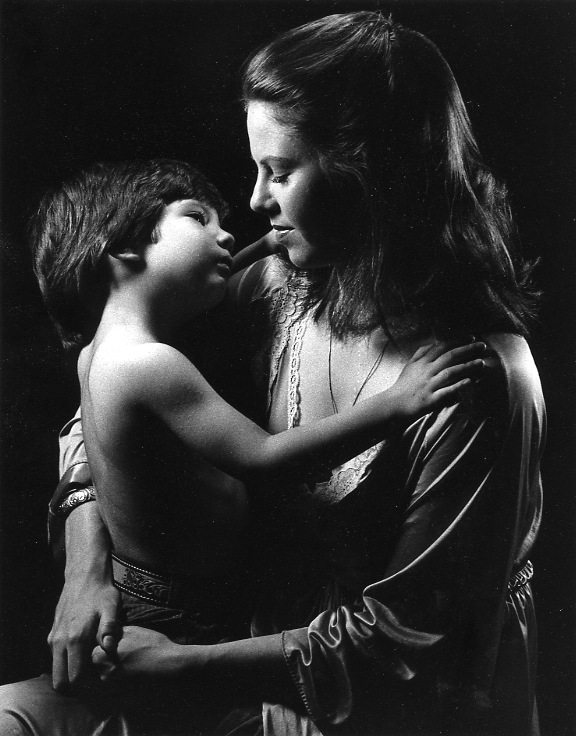
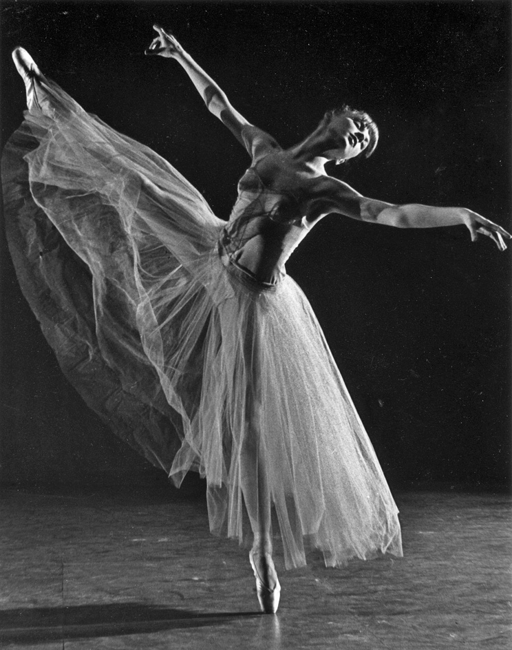
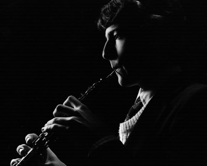
But I also did dramatic photos of everyone in black and white, rather
than color:
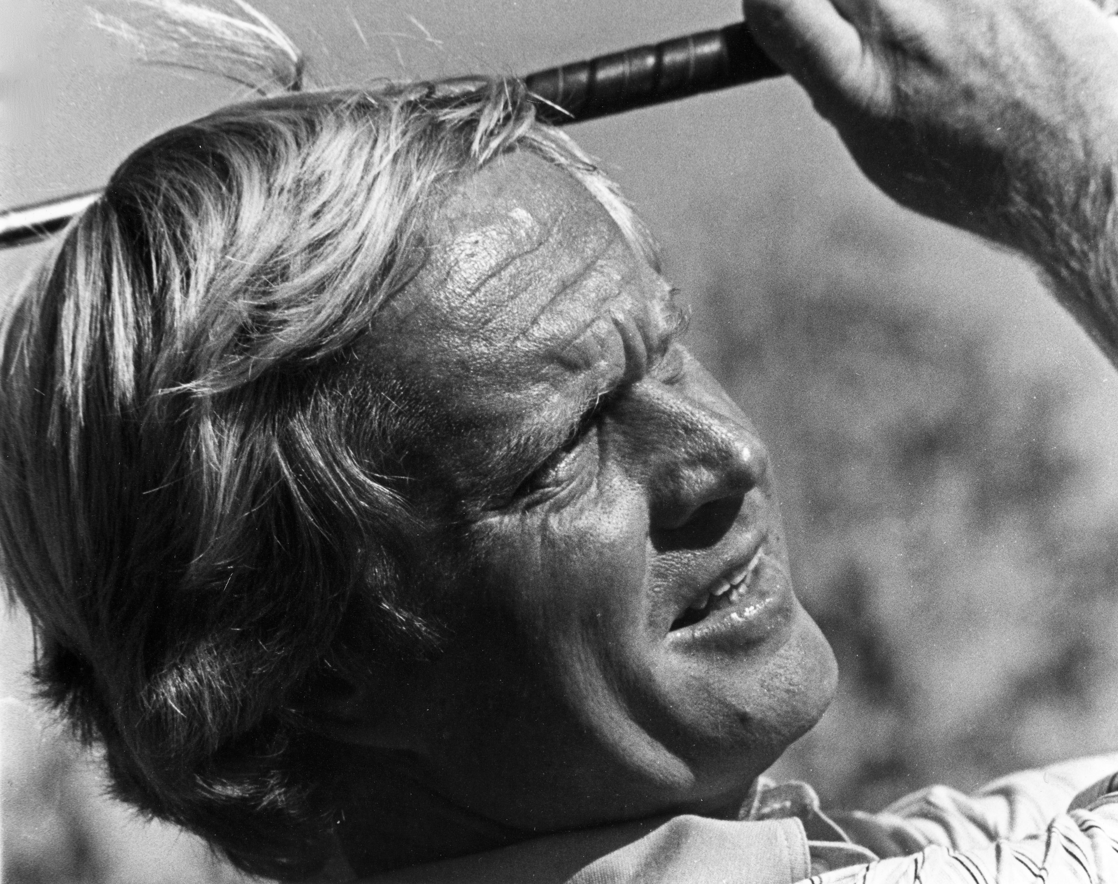
It is a merry-go round of problems leading to solutions leading to problems. Researchers such as Joy Buolamwini of the MIT Media Lab have been advocating to correct the algorithmic bias that exists in digital imaging technology. You see it whenever dark skin is invisible to facial recognition software. That may just be a problem of the physics of photography, which is essentially using light to expose film or a sensor, particularly in contrast to shadow areas. Insofar as black skin doesn't afford that kind of reflectivity and contrast it takes a more sensitive medium and ability to distinguish shadows from dark skin areas. The same technology that misrecognizes individuals is also used in services for loan decisions and job interview searches. Yet, algorithmic bias is the end stage of a longstanding problem. Award-winning cinematographer Bradford Young, who has worked with pioneering director Ava DuVernay and others, has created new techniques for lighting subjects during the process of filming. Ava Berkofsky has offered her tricks for lighting the actors on the HBO series Insecure — including tricks with moisturizer (reflective is best since dark skin can absorb more light than fair skin). Postproduction corrections also offer answers that involve digitizing the film and then color correcting it. All told, rectifying this inherited bias requires a lot of work. I think it is fair to say that until film makers began using more black actors, there may not have been incentive or opportunity to develop techniques for filming people with darker skin better; so that can likely be blamed on racism in the movie industry, but not racism in the science and technology of photography and film.
What
is preventing us from correcting the inherited bias in camera and film
technology? Is there not a fortune to gain by the technology giant who
is first to market? But
business in general is always slow, and often reluctant, to tap into
new markets. When Chester Carlson was working on creating the
photocopying device that became the Xerox machine he looked for IBM to
invest in his work and the CEO of IBM declined saying there was no need
for such a machine because they already had carbon paper. I met a
man from Rochester, NY one time who was offered Xerox stock when it
first came out, and he turned down buying it. Not everyone bought
Microsoft of Apple stock. The big three American auto makers scoffed at
smaller foreign cars. In 1961, Eddie Einhorn paid something like
$6,000 to the NCAA for the exclusive TV rights to the NCAA men's
basketball finals between Ohio State and the University of
Cincinnati. Only two markets bought the broadcast from him, Ohio
and Kentucky. You cannot always blame slow growth on racism.
Moreover, I was told long ago that the hot market for cell phones when
they first came out was black people because it was a luxury they could
afford the monthly payments of. They could be either
tapped into or just taken advantage of, depending on whether one was a
racist selling them phones or someone trying to help them out. The
payday loan industry targets all kinds of disadvantaged people, many
black, out of greed, not benevolence. So having blacks as a
market, like having whites as a market, doesn't insure inclusiveness
that is not simply callous (racist) exploitation.
Yet,
for many, the question is still: Why does inclusive representation
matter so much? The answers come through viral examples such as the
image of a young 2-year-old Parker Curry gazing up at Michelle Obama’s
portrait by Amy Sherald at the National Portrait Gallery, her mouth
dropped open, convinced that Mrs. Obama was a queen. Former White House
photographer Pete Souza has captured an image of a young boy, just 5
years old, who wanted to know if his hair texture really did match that
of the president. You can’t become what you can’t accurately see. Of
course, and that is a reasonable argument for minorities to be included
fairly and representationally and given their due as worthy
photographic subjects, in their own right, and to be important role
models for others. But prejudice against that has nothing to do
with whether there is discrimination, bias, or prejudice against people
of color in the invention and improvements of cameras and visual
recording media.
I often wonder what would have come of more time to talk with the technician. Her eyes were glassy as she said goodbye. Mine were, too, grateful for her vulnerability. The exchange was the result of decades of socialization that we often don’t acknowledge has occurred whenever we look through the lens.
Race changed sight in America. This is what my grandfather knew. This is what we experience. There is no need for our photographic technology to foster it.
Sarah Lewis is an assistant professor at Harvard University in the department of history of art and architecture and the department of African and African-American studies. She is an author, a curator and the guest editor of the “Vision & Justice” issue of Aperture (2016), which received the 2017 Infinity Award for Critical Writing and Research from the International Center of Photography. This week’s event grows out of her research and teaching in her course, Vision & Justice: The Art of Citizenship.