|
In a Very Important Sense There Are More
Than 26 Letters in the English Alphabet
Rick Garlikov I would like to give an explanation for why we should
consider the English alphabet as having 34 letters (or possibly 36, or even 39)
instead of the usual 26 it is said to have.
There are two exceptions to my explanation, and I will point them out
after I give the explanation, which is that upper and lower case versions of
letters that do not look at all alike should be considered two different
letters even though they have the same letter name and even though they have
the same sounds in words. I’ll explain
that more fully shortly.
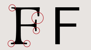
the pairs in the aqua color boxes have very different looking lower-case shapes from their upper-case
ones. For example "G" does not look at all like "g" and "R" does not look at all like "r". There are eight such pairs. In the white boxes, the upper- and lower-case letters
look identical, or nearly identical, except for size.1 The three yellow boxes could be
considered to have lower- and upper-case letters that resemble each other
sufficiently to be fairly readily recognized as being the same letter (i.e.,
the letter with the same name) or they might be considered different enough
from each other to be different letters that sound the same and have the same
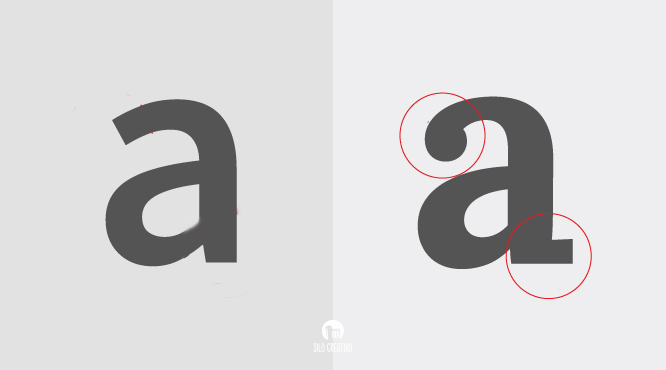
name. The pairs in the gray boxes
resemble each other more than the ones in the aqua boxes do, but less than
the ones in the yellow boxes – the “b” is one curved stroke short of the “B”,
and the “h” is one straight stroke short of the “H”).
The letters in the green boxes seem to me to be something of a
cross between those in the yellow boxes and those in the white ones --
fairly similar between lower and upper
case, but where the dot above the rest of the letter indicates lower
case in the same way that size difference does in the letters in the
white boxes; the bottom portion of the lower case "i" and the
lower case "j" are a smaller size "I" and "J" respectively, but the dot
both designates that and also disguises it for someone just learning to
read letters. It might be that students who have difficulty
learning to recognize and read letters could be helped by giving them
print that has all upper case letters first or all lower case letters
first, so that they can learn just the 26 letters instead of having to
learn to recognize the variations found in the opposite case. Once
they become more comfortable reading in one case, they can practice
reading in the other case, and then finally practice normal print with
the two cases combined. I don't know whether that might actually
help struggling readers or not, but theoretically it might.2 I mention all this because it seems to me it has great bearing on the ease or difficulty of learning to read and on reading for people who have difficulty recognizing, remembering, or distinguishing shapes, particularly abstract symbols such as letters. The more different symbols you have to learn in order to be able to read a language, the more difficult it is for some people, particularly in a language like English, which is not particularly phonetic because some letters have different sounds (such as ‘hard’ and soft “c’s” and “g”s) or where vowels have long and short or other sounds, depending on other parts of the word, and where different combinations of letters have different possible sounds. For example, George Bernard Shaw pointed out that “ghoti” would spell the word “fish” if you pronounced the “gh” as in “rough”, the “o” as in “women”, and the “ti” as in “nation. 2) Similarly, the different
visual appearances of the 26 letters have the same sounds in the same
words or contexts where they appear, although, as pointed out, since
English is not phonetic in the sense of each letter having only one
sound and always being pronounced the same, the number of sounds letters
have in English are far, far more than 26, and are often different in
different words. As one comedienne pointed out on a recent TV
show, in the word "eight" the only letter that seems to fit and make
sense is the "t". Or others have talked about the "silent p" in
"psychology" or the "silent k" in "knowledge", which makes you wonder
whether the word "acknowledge" shouldn't be thought of as "ack -
nowledge" rather than "ac - knowledge".... But the point is that those
who know how to read well generally never knew, or have forgotten, how
complex reading is -- in that it is a visual representation of speech,
which is a complex process involving all kinds of intricate sound/symbol
correspondence that is something of an approximation to how to write
what words sound like. If you imagine trying to spell what thunder
sounds like so someone would recognize by reading it what sound you are
trying to convey, or if you imagine trying to spell the sound of a
catcher catching a fastball or the sound of laughter or applause, you
would see that capturing sounds with letters is no simple, obvious, or
automatic task. Now if you believe that reading basically involves phonetically sounding out words, then you ought to be able to read the following story, and you ought to be able to read it quite easily. After all, this is how things look to your children when you want them to read by means of phonics. By the way, if you cannot understand it, just read it out loud to someone who is not looking at the printed words. They will tell you what you are reading to them even though you won't know what you are reading. And they won't understand how you can possibly NOT know what you are reading. If you have tried to understand what that paragraph says, but cannot do it, here is what you are reading written in its normal way.Wants open a dime, depend add ark and chanted farce, tear vase a would cut her widow eye fanned a ladle gull bide an aim off Fred rotten hut. Wand Ada ladle gull smothers headed waste I'm far hurt ago tour gram mudder souse widow bass cat fool off me tend utters tougher gram auto heifer herd inner. Ladle read rotten hut vase knot toot airy or fuller hound Honda weigh to grammars souse. Butter ladle gull too curt I'm end vase topped buy a be Gary wool few wand it too nowhere sheer gong. "Two migraine mud errs souse toot acre this bass cat ford inner...." And even for capturing the sounds
of words printed in the normal way through normal spelling and typing
them out with letters, it
is not an easy task for someone to read what you type who has more than
normal difficulty learning to identify letters by their shapes.
(And I say "type" to avoid the pitfalls of deciphering handwriting,
which makes reading even more difficult generally.) And there are
at least eight letters in English that have two totally different
shapes when typed or printed, so instead of learning to read eight
letter shapes, one has to learn 16 letter shapes to recognize the eight
letters, besides having to learn the other letters of the alphabet
also. So there are more than 26 characters one has to learn in
order to be
able to read English. That is not an easy task for someone who has
trouble with shape recognition and distinguishing relatively minor
differences in shapes.
Footnote 1 for a bit more completeness for those
who will find it interesting, but not necessary for the main point of
this essay for those who will not find it interesting:
Footnote 2: Some languages have additional variety, depending, for example, on where a letter appears in a word. For example in Hebrew, the letter called Nun, which is equivalent to the English letter "n", whose name if written out would look like "En": |
||||||||||||||||||||||||||||||